The first time an average person looks at any crypto price chart, they may as well be staring at ancient hieroglyphics.
Introduction
When you first start your virtual currency journey, learning how to read crypto charts can be proven as an essential skill if you want to make a viable income from the industry. While cryptocurrency is a profitable investment, most enthusiastic traders jump in without sufficient knowledge to sustain their investments and they end up cutting their losses earlier than they should.
To become a successful cryptocurrency trader, you will first need to learn how to read cryptocurrency charts. However, it’s no secret that absorbing all the technical analysis and jargon that goes along with it can be pretty intimidating for beginners. For anyone not already familiar with the ins and outs of the trading industry, this entirely new ecosystem can feel like a foreign country in itself.
The Technical Analysis (TA) that comes ingrained in these charts can be quite cumbersome for newbies. But developing the right mindset and skills towards deciphering these crypto charts is an art form, one you will carry with you forever and will prove highly beneficial in the long-term.
In a nutshell, crypto charts are a series of lines and candlestick patterns that illustrate the historic price performance of a cryptocurrency. They can help traders predict upcoming trends and changes in market conditions, helping them make better investment decisions along the way.
In this guide, we will help you understand the basic pinnacles of cryptocurrency charts through one of its most highly utilized sources: candlestick charts.
Candlestick Charts
With crypto candlestick charts, these can give you a more objective view of the cryptocurrency price of the day versus something more subjective like intuition (which also another avenue for consideration when trading).
This type of chart is easily the most popular, for three reasons: 1) experts post analysis on candlestick charts 99% of the time, 2) they are the basic foundation of Technical Analysis (TA), and 3) they are unmistakably precise when it comes to trading.

So what does each of these candlesticks represent?
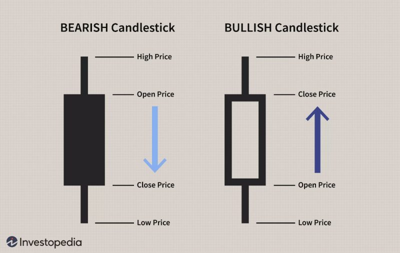
Each candle is an insight into many things: the opening price and closing price, and the lowest and highest price of the given time period. In the sample candlestick chart above, there are two kinds of candlesticks: the green candle, and the red candle.
Every candle has a body accompanied by bodies of shadows sticking out of it. The body, then, shows you the difference between the opening and closing price. The shadows show how high or how low these opening and closing prices have gone respectively. In a green candle, the upper shadow is the closing price while the lower shadow represents the opening price; and vice-versa for red candlesticks.
Elements to Candlestick Charts
1. Time Period
Perhaps this is one of the greatest factors that affect candlestick charts most. Different periods will yield different amounts of transactions that have taken place and would then produce different candlesticks, and by extension, different results.
For example, if your cryptocurrency of choice has a 5-minute map time period, then each candle will be 5 minutes. But fret not, because the time period can be changed to make it much more flexible. You can easily select from the regular time frames consisting of 5-minute, 15-minute, 1 hour, 4 hour, everyday, weekly, monthly: it all depends on how much time you’re willing to monitor the charts.
2. Trading Volume
The trading volume will show you how much trading action happened during the time period you picked, as stated above.
The longer a volume bar is, the more incentive there is to purchase or sell, or basically, make a profit. The green volume bar would highlight the increased interest in the coin and the pressure to purchase. Alternatively, the red volume bar highlights a fall in the confidence in the coin and the pressure to sell it.
3. Bearish vs Bullish Candlesticks

These candlesticks will come in various sizes. Price formations are a good way to get the lay of the land and forecast potential market trends. There are a lot of candlestick configurations that can tell what’s going to happen next, and we call these insights “map trends”.
By default, the bullish candlesticks are depicted by green candles, implying that the price has risen over the chosen timeframe. For example, if the closing price of a 5 minute candle is higher than the opening price, it falls under a bullish candlestick.
In the case of bullish candlesticks, the bottom of the thick segment represents the opening price, while the top of the body represents the closing price. The candlestick wicks reflect the highest and lowest prices during the chosen time span.
Conclusion
That covers the basics of reading crypto candlestick charts. By being able to understand stock, forex, and crypto trading charts through extensive knowledge of the day-to-day discrepancies that change them minutely can change your approach to trading altogether.
This invaluable skill at being fluent in chart reading will not only help you monitor the progress of your favourite asset, but also give you an added layer of security when choosing potential stocks to invest in – an ability any trader should master!


